The Challenge
Shell needed an awareness campaign that could connect the brand with the energy, speed, and performance world of Formula 1.
The challenge was to make Shell feel like a key player in the competition, not just a sponsor or logo on the car.
The campaign had to create strong visual impact across print and social media, while keeping the message simple and powerful.
The Objective
The main objective was awareness.
The campaign needed to increase brand recall and strengthen Shell’s association with Formula 1 performance, passion, and winning energy.
The Campaign Idea
The idea was built around one strong message:
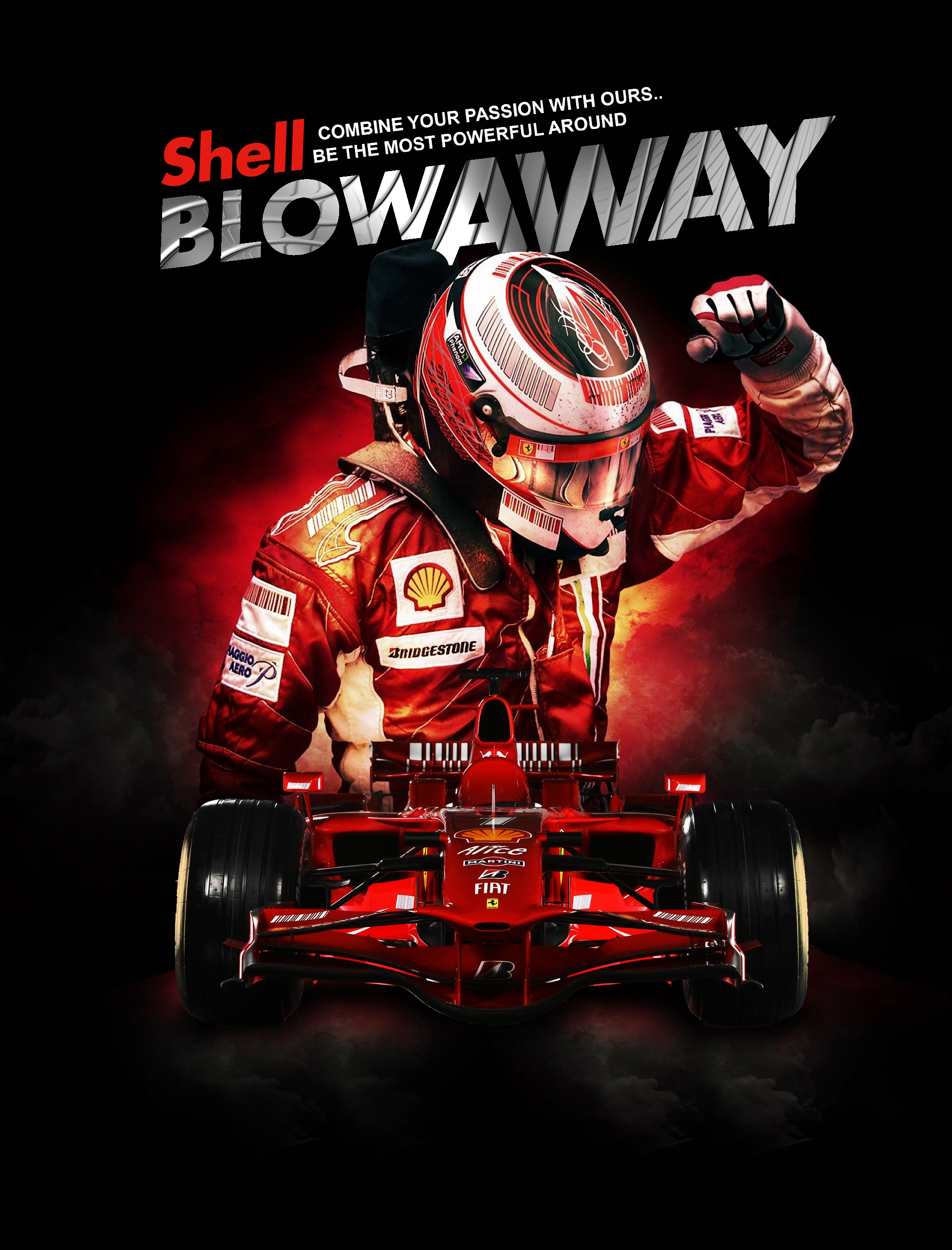
Combine your passion with ours. Be the most powerful around.
The campaign used the power of Formula 1 visuals to connect Shell with speed, control, and competitive performance.
The word “Blowaway” became the main visual and verbal hook.
It created a sense of force, dominance, and high-performance impact.
My Role
I was involved in the creative development of the campaign.
The work focused on shaping the visual direction, campaign message, and awareness communication across print and social media formats.
The goal was to create a campaign that felt bold, energetic, and instantly connected to the Formula 1 world.
Creative Direction
The artwork was designed to feel intense, fast, and competitive.
The visual system used:
- Shell red as the dominant energy color
- A Formula 1 car as the performance symbol
- A racing driver pose to create victory and power
- Dark background contrast to make the red elements stand out
- Large typography to create instant campaign recall
- Strong visual hierarchy for print and Meta placements
The result was a dramatic racing composition that made Shell feel powerful and central to the Formula 1 story.
Channel Strategy
The campaign was created for two main channels.
The print execution was designed for high visibility and instant recognition.
The bold composition made it suitable for posters, magazine placements, retail visibility, and event-related communication.
Meta
For social media, the campaign visual was built to stop the scroll.
The strong red color, racing subject, and oversized headline helped the artwork work clearly in-feed and on mobile screens.
Brand Role
Shell was positioned as more than a fuel brand.
The campaign connected Shell with:
- Speed
- Precision
- Passion
- Performance
- Racing excellence
This helped strengthen Shell’s role as a brand linked to power and motorsport performance.
The Outcome
The final campaign delivered a strong awareness visual that could work across both offline and digital channels.
It gave Shell a bold Formula 1 communication asset with a clear message, strong brand presence, and immediate visual impact.
Why This Project Matters
This project shows how visual communication can make a brand feel active inside a competitive world.
The campaign did not only show Formula 1.
It used Formula 1 energy to make Shell feel powerful, fast, and emotionally connected to performance.